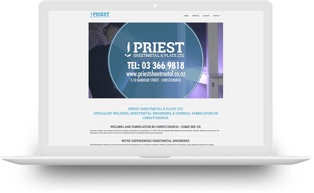
I have just finished working on an update to the www.priestsheetmetal.co.nz website. The original site was relatively simple, for a company that has been operating sixty plus years in an industry that isn’t hugely technical as the sheetmetal industry is, the fax number is important on the footer, the analytics show more people using the site on desktop than phones but they needed a presence without a large budget and now we are just slowly moving towards something more exciting.

The content has slightly updated and we have moved away from a bunch of the text for the site being tied up in the video where it was moving and less readable. Adding more background colors adds hierarchy to the elements of the page in a logical order.
With a relatively small update the site still has elements from foundation running the backend but most of the new elements have been built on CSS grid giving a flexibility with the scaling of the site between phone and desktops.


