Tag: website

Moving Priest Sheetmetal to Gatsby

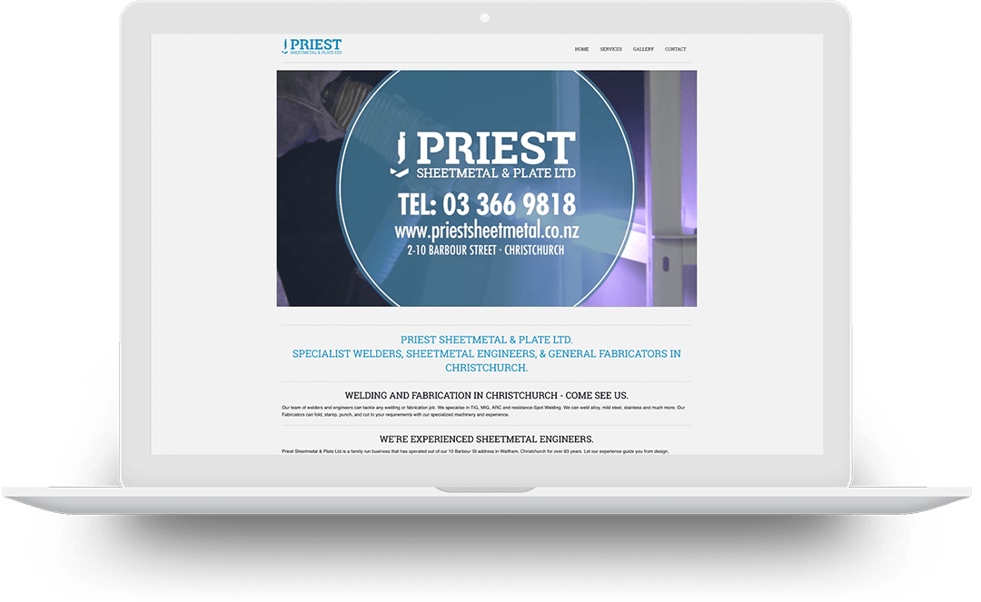
As I have continued on with Priest Sheetmetal & Plate Ltd to upgrade their website over time we made the switch from WordPress to Gatsby with a Strapi CMS.

The website itself has stayed relatively similar to look at through the transition but has resulted in a marked increase meaning we are able to work with pushing out new ideas and still holding onto a fast site for plenty of time to come thanks to the Static Site Generation and the GraphQL queries pulling it all together.

The first piece on the front end to use React in a meaningful way is already on the test servers so it will be coming soon to the live version.

I’m not sure if a straight rebuild is the right idea for everyone as the time spent in the current site makes you look at all the things you could update so a design change could be in order at the same time but for a very modest budget, I think it’s a good choice for this site and with a better flow of continuous iteration / continuous development we should be able to make those next changes faster.

I’m sure I’ve gone in circles plenty of time but the learning curve was never too bad and I’m looking forward to pushing the next site over with increased efficiency
Explore Moving Priest Sheetmetal to Gatsby

NZ Tour Guide

For a major rebuild of the one page New Zealand Tour Guide site I focused on speed and built a snappy little site with the basics of HTML, CSS, and JS producing a site that loads dramatically faster and consumes far fewer resources than what was there before.

(more…)

Explore NZ Tour Guide

Mons Royale Product Page Pitch

Over a quiet weekend I knocked up a quick pitch piece of a product page for Mons Royale, I’ve always been a big fan of their pieces and have worked with them on media projects over the years but never in as much of a design role.

I took what Mons is already doing with product and graphic design and just pushed it to a web design, using the strong colors and angles, being a quick weekend piece the site works as a mockup but isn’t truly function, there’s no hover states, only enough header tags for the page to load, javascript only powers the webpack build, there are problems with the design at certain sizes or adaptions so it would need significat work to be production ready.

The design is layers on layers of CSS grid and I’m really looking forward to the implementation of sub-grid as it comes down the pipeline, almost all of the color is either background filled grids of SVG shapes, including the promo piece (green background) halfway down which involved layering and building shapes in a way I hadn’t pushed as far before so that’s something I want to continue explore and create some dynamic and responsive designs that are super performant.

https://mons.rileybathurst.com

(more…)

Explore Mons Royale Product Page Pitch

Tahoe Web Shop

I enjoy freelancing but sometimes it comes with limitations and one of those I was running into was how to promote myself online, with such a spread out portfolio there are days I struggle to explain what I do to someone on the street so I wanted to put up a front that was simple even if it doesn’t cover half of what I can do.

Tahoe Web Shop


Explore Tahoe Web Shop

Ben Comber Landing Page

A very long time ago I was helping Ben out to build a snowboard site, so between 2010 and 2014 it was a functional site but it’s been left to hang out and languish, so we threw together something a little more exciting for a landing page. It’s really just a fun little usage of the CurtainJS tech but maybe someday we will continue to build on this and do something exciting.

The screenshot really does no justice of what this is so check it out over at BenComber.com


Explore Ben Comber Landing Page

NZ Tour Guide Propsal​

I have been hosting the NZ Tour Guide website for a number of years, it’s a pretty simple one-page site that to save costs we had grabbed a theme from Woo Themes and let it free into the world, except that was built on some code that just isn’t doing too hot on the lighthouse scores, 57 / 100 performance, in particular, was concerning to me.

(more…)

Explore NZ Tour Guide Propsal​

Authentic Alignment Wellness

I worked with Amanda from Authentic Alignment Wellness to create a website for her health and wellness coaching business.
We worked to create a flexible site with plenty of strong images surrounded by white space to let the content breathe using a two column layout.

(more…)

Explore Authentic Alignment Wellness

Priest 2019

I have just finished working on an update to the www.priestsheetmetal.co.nz website. The original site was relatively simple, for a company that has been operating sixty plus years in an industry that isn’t hugely technical as the sheetmetal industry is, the fax number is important on the footer, the analytics show more people using the site on desktop than phones but they needed a presence without a large budget and now we are just slowly moving towards something more exciting.

priest 2016 website
Website before the update

The content has slightly updated and we have moved away from a bunch of the text for the site being tied up in the video where it was moving and less readable. Adding more background colors adds hierarchy to the elements of the page in a logical order.

With a relatively small update the site still has elements from foundation running the backend but most of the new elements have been built on CSS grid giving a flexibility with the scaling of the site between phone and desktops.


Explore Priest 2019

Pacrav

I have been working with Matthew at Pacrav as he has been setting up his new physiotherapy business in Reno, Nevada. We have been working on branding and website needs.

The logo for Pacrav is based around the idea of movement, flexibility and strength, we created a unique shape that has an inclusion of the double “A” with a custom word mark and can be used with the tag line as well as in individual parts.

Pacrav has been strongly branded in orange as a bright and lively color which can be used for branding elects or used as a background with white elements over it.

The site with all its branding and ideas can be found at pacrav.com aside from the regular website needs of a business in this day and age but we have taken that further streamlining the consultation forms, since these have been setup Matt has found it has saved time for patients as well as employees.

The site was built on a foundation framework with a wordpress Content Management System, with these together we we’re able to create a site that was affordable but also preforms strongly in many environments, the site is fast and responsive across devices with modern and documented code for easy updates and additions.


Explore Pacrav

Priest

Working with Priest Sheetmetal has had me spanning from graphic design to photography and branding then back again, as a local staple in an older industry the Priests are in their third generation of running the company and showing no signs of slowing down so they are embracing the modern design style and modern methods of reaching customers. The logo is a sheetmetal press which may get lost to those outside of the industry but they are ok with that as it still creates an interesting shape. The branding then rolls into the slab serif typeface to create a sturdy foundation as a reflection of the metal products they build. From the strong foundation of the icon, slab serif typography and a strong blue we have been able to build up into marketing materials from business cards to a website that is quick and to the point.


Explore Priest