Working with Priest Sheetmetal has had me spanning from graphic design to photography and branding then back again, as a local staple in an older industry the Priests are in their third generation of running the company and showing no signs of slowing down so they are embracing the modern design style and modern methods of reaching customers. The logo is a sheetmetal press which may get lost to those outside of the industry but they are ok with that as it still creates an interesting shape. The branding then rolls into the slab serif typeface to create a sturdy foundation as a reflection of the metal products they build. From the strong foundation of the icon, slab serif typography and a strong blue we have been able to build up into marketing materials from business cards to a website that is quick and to the point.
Priest
Priest Sheetmetal & Plate Ltd is a family run business that has operated out of our 10 Barbour St address in Waltham, Christchurch for over 63 years. Let our experience guide you from design, manufacture, to assembly and installation of your fabrication project.
Website
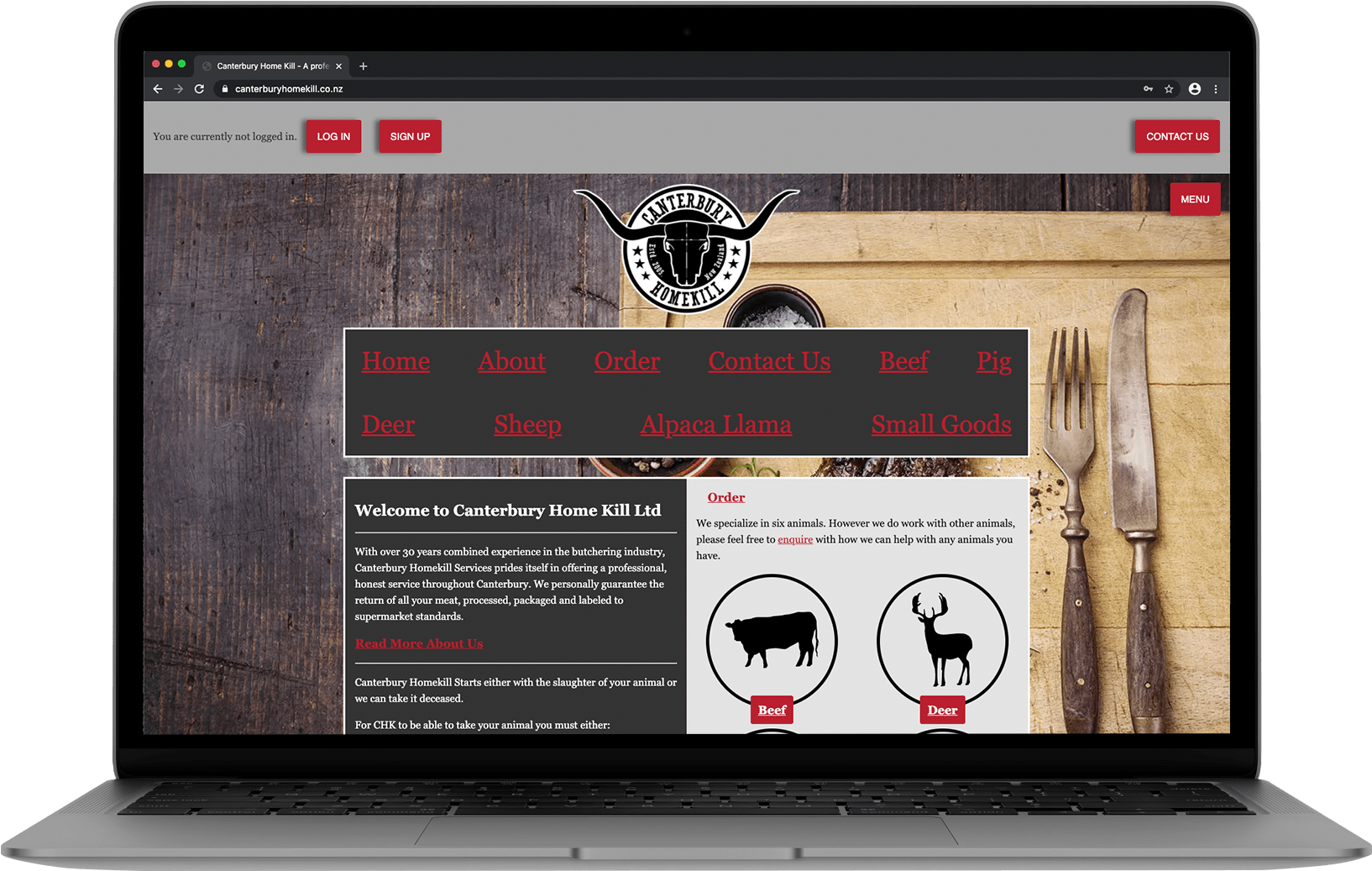
I have been working with Priest to develop the website for the past few years, slowly up the site and continuing to do so.
Written in JS with a strapi CMS and a Gatsby static site build allowing for a responive design adapting from phones to desktop screens.
Priest » Website
Development.
Branding
The logo for Priest Sheetmetal was designed to show the strength and presence of metal with the slab serif typography beside a sheet press icon.
Photography
This set of photos is for a website header banner, the images were a specifically wide ratio and showcase the reality of a sheetmetal factory to show authenticity and convey trust that the workshop has multiple machines and they are ready to handle all your needs.
Employee loading sheet metal
Factory floor
Welding
Click photos to expland
Business Cards
As we have gone througha few versions of business cards for Priest we have landed on a modernist front with a bold logo and a large amount of the bright blue primary color and then an information dense back to give potential customers a list of services available as Priest have a large number copared to many of their compeitors as well as a number of contact points for the front desk as well as the employee on the card.
Priest » Design
Graphic Design.
Video
Priest » Video
Moving images.
Exlpore More
Working with Priest Sheetmetal has had me spanning from graphic design to photography and branding then back again, as a local staple in an older industry the Priests are in their third generation of running the company and showing no signs of slowing down so they are embracing the modern design style and modern methods […]