Pacrav

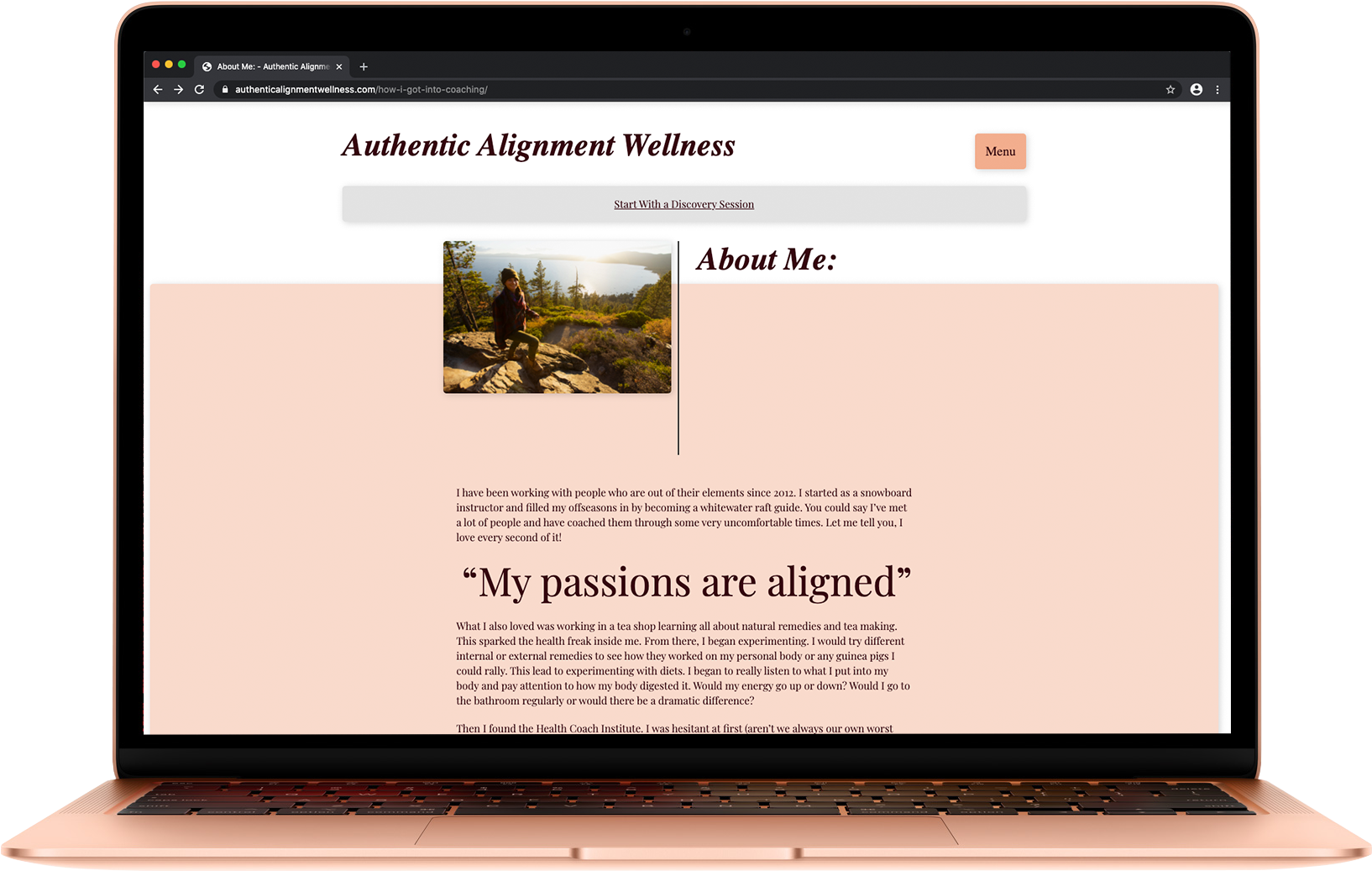
I have been working with Matthew at Pacrav as he has been setting up his new physiotherapy business in Reno, Nevada. We have been working on branding and website needs.

The logo for Pacrav is based around the idea of movement, flexibility and strength, we created a unique shape that has an inclusion of the double “A” with a custom word mark and can be used with the tag line as well as in individual parts.

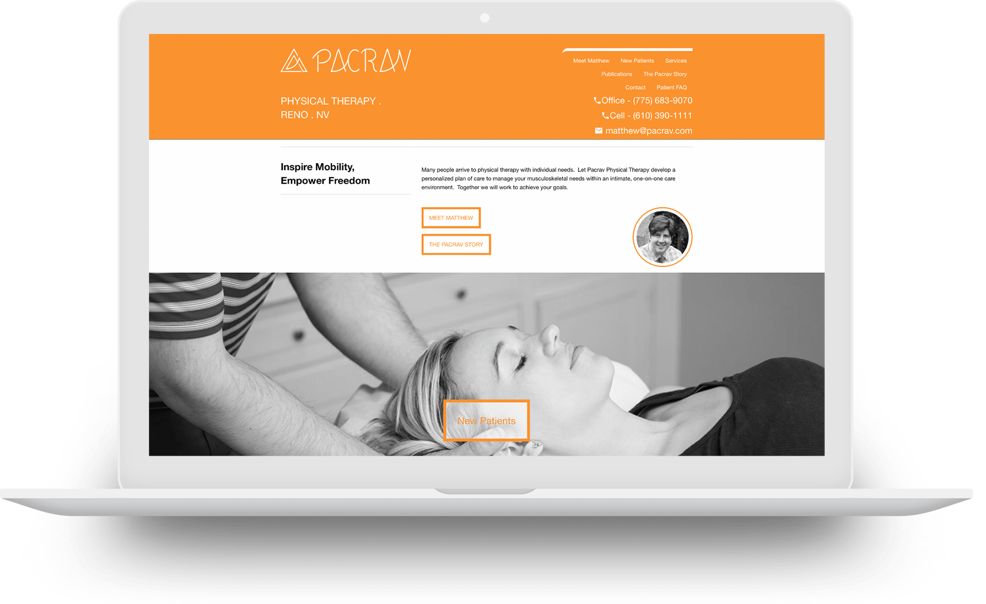
Pacrav has been strongly branded in orange as a bright and lively color which can be used for branding elects or used as a background with white elements over it.

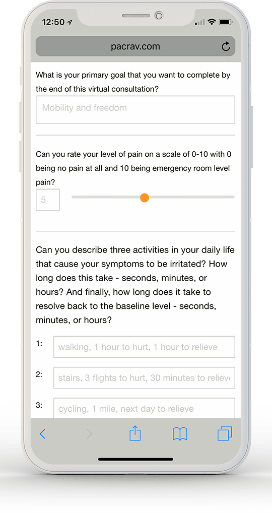
The site with all its branding and ideas can be found at pacrav.com aside from the regular website needs of a business in this day and age but we have taken that further streamlining the consultation forms, since these have been setup Matt has found it has saved time for patients as well as employees.

The site was built on a foundation framework with a wordpress Content Management System, with these together we we’re able to create a site that was affordable but also preforms strongly in many environments, the site is fast and responsive across devices with modern and documented code for easy updates and additions.
Website

pacrav virtual consultation form on a phone

Pacrav Virtual Consultation

The site with all its branding and ideas can be found at pacrav.com aside from the regular website needs of a business in this day and age but we have taken that further streamlining the consultation forms, since these have been setup Matt has found it has saved time for patients as well as employees. The site was built on a foundation framework with a wordpress Content Management System, with these together we we're able to create a site that was affordable but also preforms strongly in many environments, the site is fast and responsive across devices with modern and documented code for easy updates and additions.

Branding

pacrav branding full logo and icon

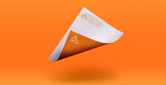
Pacrav branding, shown in multiple ways, a full use in the Pacrav orange on white with a use of the icon alone as a negative with white on the Pacrav orange background.


Business Cards

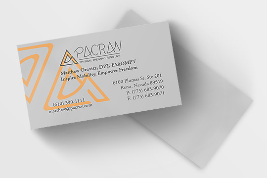
pacrav business cards front and back

Pacrav business cards use a layering of the icon and the full logo. As a simple design we have gone with a one sided design, this also helps to scribble notes for potential patients on the back.

Exlpore More

I have been working with Matthew at Pacrav as he has been setting up his new physiotherapy business in Reno, Nevada. We have been working on branding and website needs. The logo for Pacrav is based around the idea of movement, flexibility and strength, we created a unique shape that has an inclusion of the […]

Explore Authentic Alignment Wellness

Leave a Reply

Your email address will not be published. Required fields are marked *

Tags